Awhile back, I commented on two different ways to visualize the ongoing process of political polarization in the U.S. The first was an animated map from Washington Post, the second was an attraction-and-repulsion nodal model produced by Renzo Lucioni and republished by at The Economist.
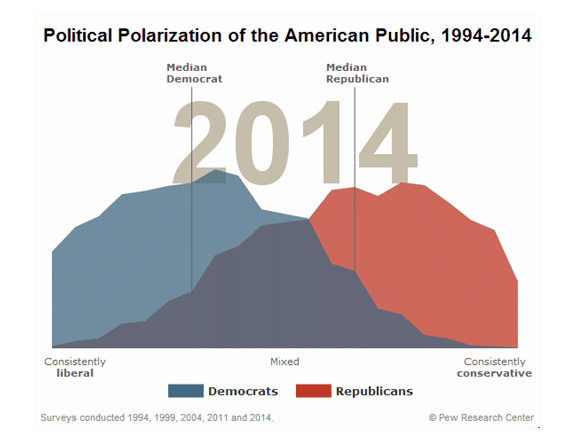
Recently, I became aware of another way to visualize the problem of political polarization, produced by Pew Research.

Go check it out for yourself. See if you can figure out when the two partisan medians started accelerating apart. For bonus points, come up with a decent hypothesis as to why this is happening.
