
Philip Bump over at WaPo has put together a stunning graphical illustration of how the U.S. has become increasingly politically polarized at the county level. Go stare at it for awhile and then scroll down to play with the interactives. These data help explain, to some extent, why the legislature itself has become measurably more partisan since around 1990.
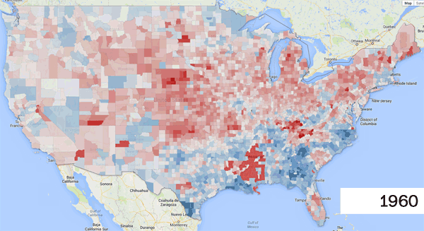
Bear in mind here that around 80% of the U.S. population is crammed into geographically small high density cities, so the bulk of what you are seeing in this map are the color changes for those living in large swaths of land with relatively low population density. There is a clever way to compensate for this problem, of course, but its sort of mindbending to look at.
If you’ve any thoughts on why the electorate itself has become increasingly polarized over time, please leave them in the comments below. Personally, I blame the media.
ETA: I’ll get back to producing my own graphs or charts next week, pinky swear.