
I’ve been seeing the following image floating around on the Twitter lately:
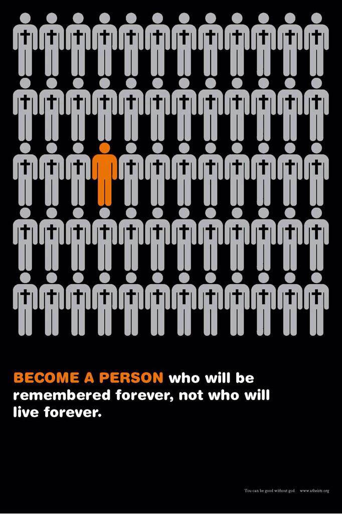
I really like what American Atheists is trying to convey here: Stand up for your unbelief, stand apart from the crowd, be good without God, etc. All positive messages, all worth sharing. The only problem here is that this image dramatically understates the amount of religious diversity and religious nonaffiliation in the United States. There might be some small town (perhaps somewhere in the Oklahoma panhandle) where the population really is 1.666% Atheist and 98.333% Christian (implicitly all the very same sort of Christian) but this is not the reality in which most Americans find themselves today. In truth, our nation is fairly religiously diverse and becoming more so with every passing year, as we saw in the recent Nones on the Rise report from Pew. The following table is excerpted from page 13 of the full report:
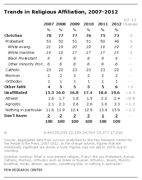
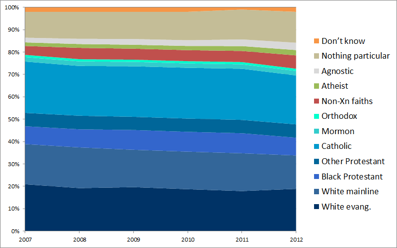
Notice how we unbelievers are becoming less of an isolated minority over time, and how much religious and ethnic diversity there is to be found within Christianity itself. The data table looks something like this if you turn it into a graph:
In terms of little stick people, it might look something like this:
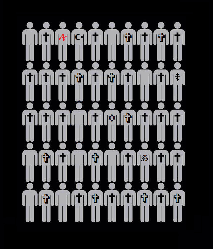
Of course that is not nearly as punchy an image as the original, but it is much more true to the national-level data, and it would be a far more diverse and interesting place to live than the hypothetical homogenous community represented by the original meme.