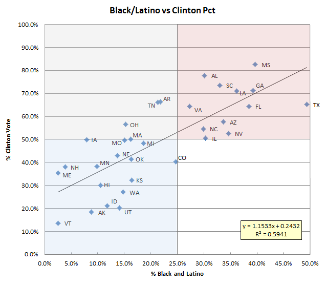
A couple of days ago, a friend tipped me off to the following scatter plot by Will Jordan, illustrating the race between Clinton and Sanders:
Bernie Sanders's performance broken down by statewide %white population and whether contest was a caucus/primary pic.twitter.com/uVStpEyyqf
— Will Jordan (@williamjordann) March 27, 2016
This was followed by some good discussion about regression and r-squared measures for goodness of fit.
It occurred to me that the percentage of “Non-Hispanic White” (Lord, how I hate that phrase) is basically acting as negative correlate for the Black and Latino vote, which is why Alaska and Hawaii seem like outliers in his plot. Accordingly, I recreated the graph using combined percentages of African Americans and Latinos by state.
 Even after seeing Jordan’s scatterplot, I was surprised at how tight the pattern is here. Nearly 60% of the variance in Clinton support can be explained by simple linear model based on the fraction of the population which falls into just two categories. She has yet to lose the popular vote when those categories exceed 25% combined.
If this model holds up—of which I make no assurances—what would it tell us about the delegate-rich races coming up in New York (247 pledged delegates), Maryland (95 pledged delegates), Pennsylvania (189 pledged delegates), California (475 pledged delegates), and New Jersey (126 pledged delegates)? New York is 15.9% Black, 17.6% Latino; Maryland is 29.4% Black, 8.2% Latino; Pennsylvania is 10.8% Black, 5.7% Latino; California is 6.2% Black, 37.6% Latino; and New Jersey is 13.7% Black, 17.7% Latino, according to the same census data upon which the above plot was built. If the model does prove predictive, Clinton would likely win all of these large states except for Pennsylvania, which may well go to Sanders.
All the usual caveats apply; no doubt there are vastly more refined ways to model the nominating contests based on underlying demography. If you happen to find one in the wild, please do let me know.
